CSS - 레이아웃!
레이아웃 개요
CSS에서 가장 중요한게 레이아웃
레이아웃을 잡기 위해선 padding, border, margin 의 크기
block 레벨 요소인지 inline 레벨 요소인지 파악하고,
아래로 추가해 나갈건지 우측으로 추가해 나갈건지 알아야 한다.
contant, padding, border, margin
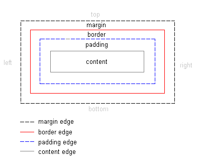
모든 태그에는 contant, padding, border, margin이 있다.
심지어 아무것도 없는 body태그에도
margin이 8px 있다.
크롬 개발자 모드에서 쉽게 확인 가능
contant: 내용물에 대한 길이,
padding: 경계선(border)안의 안쪽 공백,
border: 경계선,
margin: 경계선 밖의 바깥쪽 공백.
각 태그별로 기본 margin과 padding이 얼마나 잡혀있는지 모른다.
레이아웃을 설정하는데 방해가 되는경우가 많아 디자인을 위해 맨 처음부터 0으로 설정하는 경우가 많다.
CSS 사용하면 요소마다 할당된 공백을 0으로 설정하는 것이 가능하다.
margin
margin은 중복되지 않고 겹친다!
2개의 div 가 각각 margin을 20px 가지고 있을때 2개의 태그 사이의 공백은 20px이다.
...
<style>
    div {
        border: solid 1px gray;
        height: 20px;
        margin: 20px;
    }
</style>
...
<body>
    <div>Lorem ipsum dolor.</div>
    <div>Incidunt cumque soluta?</div>
</body>
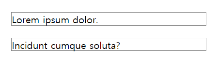
div사이의 공백이 20px 인것을 확인
가운데 정렬을 하기위해 margin: 0 auto 속성을 사용하면 된다.
아래와 같은 설정이다.
margin-top: 0px;
margin-bottom: 0px;
margin-right: auto;
margin-left: auto;
<div style="width: 60%; border: solid 3px gray; margin: auto;">
    <p>Lorem ipsum dolor sit amet.</p>
</div>
60% 크기 div 태그가 가운데 정렬된다.
box-sizing
기본적으로 html 요소 크기는 content-box 를 기준으로 한다.
content 에 의해 html 요소 크기가 결정된다는 뜻이다.
예로 부모 width: 300px, 자식 width: 50% 설정되어 있을 경우
자식 width 는 150px 이 되지 않는다.
부모 content 의 길이 가지고 width가 결정되기 때문이다.
때문에 실제 레이아웃을 예측하기가 매우 어려워 아래와 같이 border-box 기준으로 요소 크기를 결정하도록 변경한다.
* { box-sizing: border-box; }

* {
  -webkit-box-sizing: border-box;
     -moz-box-sizing: border-box;
          box-sizing: border-box;
}
이제 눈에 보이는 content + border + padding + margin 가 요소의 크기를 결정짓는다.
border 까지의 크기를 기준으로 삼는다.
display
html 요소 의 display 는 blokc, inline, inline-block 으로 나뉨
block
block 속성은 그 자체로 한 줄을 완전히 차지
대표적인 block레벨 요소로 div, p
block레벨 요소는 말 그대로 블록처럼 위에서 아래로 쓰여 내려간다.
<body style="background-color: black">
    <div style="background-color: blue; width: 60px;">Lorem.</div>
    <div style="background-color: green; width: 70px;">Maiores!</div>
    <div style="background-color: yellow; width: 80px;">Nihil.</div>
</body>
div 의 padding과 margin은 기본적으로 0
가로 길이는 100% 로 브라우저 크기에 맞춰 늘어나며 width 스타일 속성으로 고정시킬 수 있음.
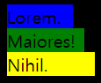
margin, width, height 속성을 정의하여 상하좌우 크기와 공백 지정가능
모양새를 쉽게 제어할 수 있는 속성 때문에 div 를 화면 구성이나 레이아웃에 사용한다.
inline
inline 속성은 줄을 바꾸지 않고 다른 요소와 함께 한 행에 위치하려함
대표적인 inline 레벨 요소는 span, a
<body style="background-color: black">
    <span style="background-color: blue; width: 100px;">Lorem.</span>
    <span style="background-color: green; width: 100px;">Maiores!</span>
    <span style="background-color: yellow; width: 100px;">Nihil.</span>
</body>
span태그에선 width, height 는 content길이에 맞춰 설정된다.
고정 100px 설정도 먹히지 않는다.
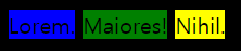
margin-top, margin-bottom 속성도 먹히지 않는다.
inline 상하 여백은 line-height 속성으로 적용시킬 수 있다.
inline태그 안에block태그를 넣으면 오류를 야기할 수 있음으로 권장하지 않음
inline-block
inline + block 의 합성 속성
기본적으로 inline-block 속성을 가진 태그는 없으며 별도로 지정해주어야 한다.
inline 처럼 한 줄에 표현하면서도 margin, width, height 속성을 정의하여 크기와 공백지정 가능
none
화면에서 보이지 않게 하는 속성,
<h1 style="display: none;">Lorem ipsum dolor sit.</h1>
숨기는 속성으로
visibility: hidden도 있는데 레이아웃은 그대로 남고 content만 보이지 않는다.
display: table, display: tablecells
display: table을 사용하면 <table> 을 사용하지 않고 table 레이아웃을 사용가능
oeerflow 속성 처럼 float 으로 인해 height가 잡히지 않아도 display: table을 사용하면 height를 잡을 수 있다.
|display속성|설명|
|–|–|
|table | <table> 요소처럼 표현합니다.
|table-caption | <caption> 요소처럼 표현합니다.
|table-column-group | <colgroup> 요소처럼 표현합니다.
|table-header-group | <thead> 요소처럼 표현합니다.
|table-footer-group | <tfoot> 요소처럼 표현합니다.
|table-row-group | <tbody> 요소처럼 표현합니다.
|table-cell | <td> 요소처럼 표현합니다.
|table-column | <col> 요소처럼 표현합니다.
|table-row | <tr>` 요소처럼 표현합니다.
https://www.codingfactory.net/10776
block 요소들에 float: left 효과를 주고싶을땐 table-cell
inline 요소들에 블록모드같은 효과를 주고싶을땐 table-row를 쓰면 된다.
그외에 쓸만한건 특수한 상황에서 table-column-group 정도?… 나머진 거의 쓸일이 없다.
.col-container {
    border: solid 1px gray;
    width: 100%;
    display: table;
}

.col {
    background-color: #ddd;
    box-sizing: border-box;
    border: solid 2px black;
    padding: 5px;
    display: table-cell;
}
<div class="col-container">
    <div class="col">
        <h1>Column1</h1>
        <p>Lorem.</p>
        <p>Incidunt.</p>
        <p>Voluptatum.</p>
    </div>
    <div class="col">
        <h1>Column2</h1>
        <p>Lorem.</p>
        <p>Fugiat.</p>
        <p>In!</p>
        <p>Incidunt.</p>
        <p>Voluptatum.</p>
    </div>
    <div class="col">
        <h1>Column3</h1>
        <p>Lorem ipsum dolor.</p>
        <p>Quaerat tenetur temporibus.</p>
        <p>Deleniti cum odio.</p>
    </div>
</div>
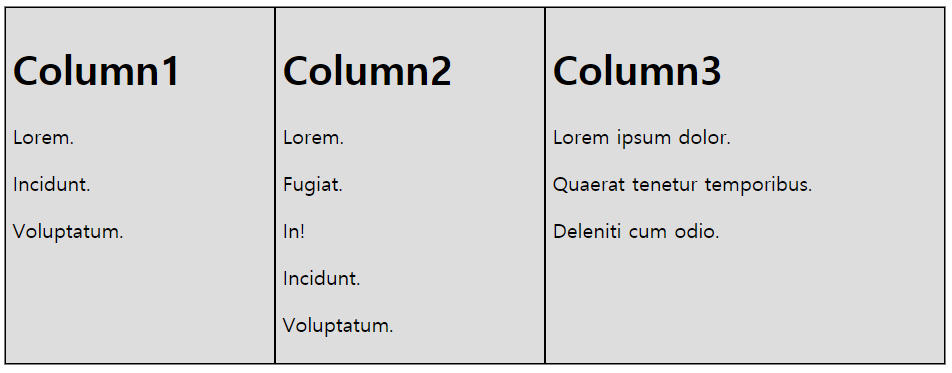
float: left을 안써도 display: table, display: table-cell로 비슷한 효과를 낼 수 있다.
float 속성
정렬을 위해 사용되는 속성
block 레벨 요소들도 float: left 를 사용하면 좌측정렬 되어 왼쪽부터 추가되어 진다.
왼쪽에서 하나씩 배치해 나갈지, 아래로 하나씩 배치해 나갈지 정할 수 있다.
아래 4가지 값중 정할 수 있음.
none(기본값)leftrightinherit(부모 상속)
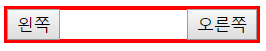
<div style="overflow: auto; border: solid 1px #ccc">
  <button style="float:left;">왼쪽</button>
  <button style="float:right;">오른쪽</button>
</div>

각 버튼에게 좌측정렬, 우측정렬 속성값을 주어 div 양 끝에 위치하도록 설정,
주의사항
float를 이용한 레이아웃을 작성할때, 부모 요소가 자식 요소의 크기를 반영하지 못하는 문제가 생긴다.
float가 적용된 요소는 문서의 흐름에서 제외되어 둥둥 떠 다니는 레이어처럼 떠있게 되는데 float 되지 않은 다른 블럭 요소들이
다른 층에 떠 있게 되어서 자식의 높이가 부모에게 전달되지 못하게 되는 것.
이를 막기위해 위처럼 overflow: auto 속성을 적용하면 떠다니는 float 속성을 가진 html 요소의 height도 부모태그가 인지하도록 할 수 있다.
또는 display: table 속성을 주면 된다.
<div style="border: solid 3px red; display: table; width: 200px">
  <button style="float:left;">왼쪽</button>
  <button style="float:right;">오른쪽</button>
</div>
단 display: table은 정말 table태그 처럼 안의 content의 길이에 따라 width가 변함으로 고정시켜 놓을 필요가 있음.
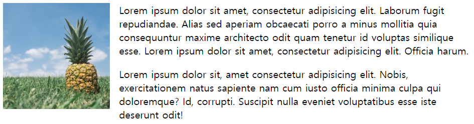
img 정렬
<img src="C:\Class\WebClass\WebPro\WebContent\css\images\pineapple.jpg" alt=""
style="width: 170px;height: 170px;margin-right: 15px;" />
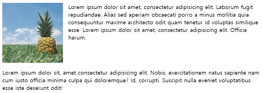
Lorem ipsum dolor sit amet, consectetur adipisicing elit. Laborum fugit repudiandae. Alias sed aperiam obcaecati porro
a minus mollitia quia consequuntur maxime architecto odit quam tenetur id voluptas similique esse.
Lorem ipsum dolor sit amet, consectetur adipisicing elit. Officia harum.
사진은 inline모드라 글이 바로 옆에 붙기는 하지만 사진 아래쪽 라인에 붙는다.
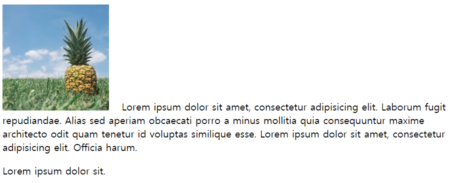
vertical-align 속성으로 수평정렬을 top으로 주면 한 라인만 위로 올라가고 나머지는 그대로 사진 아래에 배치된다.
사진 옆에 글을 붙이려면 float속성을 무조건 사용해야 한다.
<img src="C:\Class\WebClass\WebPro\WebContent\css\images\pineapple.jpg" alt=""
style="width: 170px;height: 170px;margin-right: 15px; float: left" />
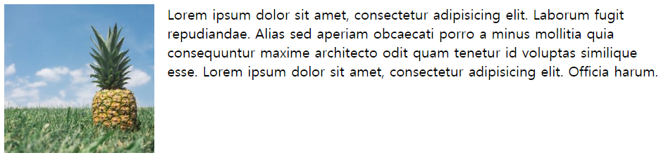
float: right를 주게되면 사진은 우측정렬 되고 글도 사진의 왼쪽에 배치되도록 설정된다.
float - clear
float은 연속된 레이아웃을 편하게 잡게 해준다. 하지만 다른시각으로 보면 보면 다른 태그의 레이아웃에 영향을 주는 행동이라 할 수 있다.
가끔 block모드 p태그 2개를 사용해서 레이아웃을 잡을 때
당연히 block모드니까 아래로 추가되겠다고 생각하지만 p태그 안에 float: left속성을 가진 요소가 있다면 불확실해 진다.
<p>
    <img src="C:\Class\WebClass\WebPro\WebContent\css\images\pineapple.jpg" alt=""
        style="width: 170px;height: 170px;margin-right: 15px; float: left"" />
    Lorem ipsum dolor sit amet, consectetur adipisicing elit. Laborum fugit repudiandae. Alias sed aperiam obcaecati
    porro a minus mollitia quia consequuntur maxime architecto odit quam tenetur id voluptas similique esse.
    Lorem ipsum dolor sit amet, consectetur adipisicing elit. Officia harum.
</p>
<p>
    Lorem ipsum dolor sit, amet consectetur adipisicing elit. Nobis, exercitationem natus sapiente nam cum iusto officia
    minima culpa qui doloremque? Id, corrupti. Suscipit nulla eveniet voluptatibus esse iste deserunt odit!
</p>
분명 p태그이기 때문에 아래 p태그는 사진 아래에 레이아웃이 잡힐것 같았지만 실제론 사진 옆에 붙는다.
두번째 p 태그 이하로는 img태그에 적용된 float 속성을 지우고 싶을때 사용하는 css 속성이 clear 이다.
<p>
    <img src="C:\Class\WebClass\WebPro\WebContent\css\images\pineapple.jpg" alt=""
        style="width: 170px;height: 170px;margin-right: 15px;" />
    Lorem ipsum dolor sit amet, consectetur adipisicing elit. Laborum fugit repudiandae. Alias sed aperiam obcaecati
    porro a minus mollitia quia consequuntur maxime architecto odit quam tenetur id voluptas similique esse.
    Lorem ipsum dolor sit amet, consectetur adipisicing elit. Officia harum.
</p>
<div style="clear: both"></div>
<p style="clear: both;">
    Lorem ipsum dolor sit, amet consectetur adipisicing elit. Nobis, exercitationem natus sapiente nam cum iusto officia
    minima culpa qui doloremque? Id, corrupti. Suscipit nulla eveniet voluptatibus esse iste deserunt odit!
</p>
2개의 p태그 사이에 <div style="clear: both"></div> 같은 content가 없는 태그를 집어 넣거나
<p style="clear: both;">처럼 태그 자체에 속성을 주어도 된다.
즉 clear: both가 선언된 이후 전에 float 무엇이었든 간에 사라진다는 뜻.
overflow 속성
안의 내용물이 너무 많아서 잡은 레이아웃에서 튀어나올경우 처리하는 속성
visible, hidden, scroll, auto 등의 속성값이 있다.
visible
overflow를 사용하지 않아도 적용되는 default값, content가 border 밖으로 튀어나와도 visible!
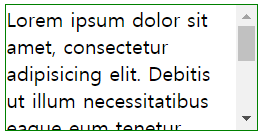
<div style="border: solid 1px gray; width: 200px; height: 100px;">
    Loremipsum dolor sit amet, consectetur adipisicing elit. Debitis ut illum
    necessitatibus eaque eum tenetur voluptatibus porro possimus
    reiciendis voluptatem. Nihil quas atque sunt inventore sapiente minima
    ipsam possimus quasi!
</div>
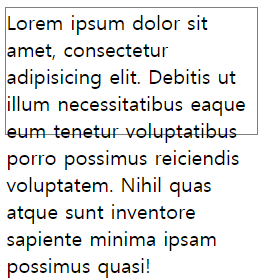
그림처럼 div의 특성상 width 너비를 유지하지만 height는 유지하지 않는다,
안의 content가 border 밖으로 튀어나오면 다른 레이아웃을 가리는 상황이 발생한다.
이런 상황을 원천 방어하기 위해 overflow를 사용.
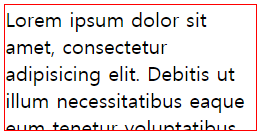
hidden
content가 border 밖으로 튀어나오면 튀어나온 부분을 출력하지 않음.
<div style="border: solid 1px red; width: 200px; height: 100px; overflow: hidden;">
    Loremipsum dolor sit amet, consectetur adipisicing elit. Debitis ut illum
    necessitatibus eaque eum tenetur voluptatibus porro possimus
    reiciendis voluptatem. Nihil quas atque sunt inventore sapiente minima
    ipsam possimus quasi!
</div>
scroll
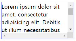
<div style="border: solid 1px blue; width: 200px; height: 100px; overflow: scroll;">
    Lorem ipsum dolor sit amet, consectetur adipisicing elit. Debitis ut illum
    necessitatibus eaque eum tenetur voluptatibus porro possimus
    reiciendis voluptatem. Nihil quas atque sunt inventore sapiente minima
    ipsam possimus quasi!
</div>
x축, y축을 담당하는 스크롤바가 생긴다. content가 넘치지 않아도 생기기 때문에 content로 출력하는 공간이 줄어들게됨
auto
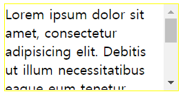
<div style="border: solid 1px green; width: 200px; height: 100px; overflow: auto;">
    Lorem ipsum dolor sit amet, consectetur adipisicing elit. Debitis ut illum
    necessitatibus eaque eum tenetur voluptatibus porro possimus
    reiciendis voluptatem. Nihil quas atque sunt inventore sapiente minima
    ipsam possimus quasi!
</div>
content가 넘치면 스크롤바가 생기고, 그렇지 않은부분은 생기지 않음(제일 많이 사용되는 속성)
overflow-x, overflow-y
x축, y축에 대해 overflow 발생시 처리하는 조건을 다르게 할 수 있음.
<div style="border: solid 1px yellow; width: 200px; height: 100px; overflow-x: hidden; overflow-y: scroll;">
    Lorem ipsum dolor sit amet, consectetur adipisicing elit. Debitis ut illum
    necessitatibus eaque eum tenetur voluptatibus porro possimus
    reiciendis voluptatem. Nihil quas atque sunt inventore sapiente minima
    ipsam possimus quasi!
</div>
기타사항
overflow는 content가 넘칠경우 다른 레이아웃 침범을 막기위해 사용도 하지만
content에 비해 layout이 너무 작을때에도 사용한다.
button:first-child {
    float: left;
}

button:last-child {
    float: right;
}
<div style="border: 1px solid gray;" >
    <button style="width: 100px;">왼쪽</button>
    <button style="width: 100px;">오른쪽</button>
</div>

div의 height가 button크기만큼 커지지 않는 이유는 float 속성 때문,
자식의 높이를 부모태그인 div가 인지하지 못한다.(float 특성)
float속성의 자식태그를 가진 부모태그의 overflow값을 기본값인 visible외의 다른 속성을 사용하면 자식 태그의 height를 인지하게 된다.