CSS - 반응형 웹!
반응형 웹
동적으로 해당 장치에서 브라우저 전체 웹 페이지의 화면이 맞게 자동 축소, 확대되어야 한다.
장치(PC, 태블릿, 스마트폰)에 따라 웹페이지의 사용자가 볼 수 있는 영역이 다름으로 장치별로 뷰포트를 설정해야한다.
뷰포트(ViewPort): 웹페이지 사용자가 볼 수 있는 영역
뷰포트는 <meta> 태그를 사용해서 설정 가능하다.
<meta name="viewport" content="width=device-width, initial-scale=1.0">
width=device-width: 페이지의 너비를 장치에 따라 설정
initial-sacle=1.0: 처름로딩될때 장치 크기에 맞게 1:1 크기로 설정된다,
작은화면, 큰화면 상관없이 1:1 크기로 웹페이지가 맞춰짐.
뷰포트에 컨테츠 크기를 맞추기
뷰포트 구성은 아래 3가지 규칙을 가짐
- 큰 고정폭 요소를 사용하지 않는다. (장치마다 넓이가 다르기 때문, 고정값을 사용하지 않는다(비율 사용))
- 특정 뷰포트 너비를 사용하여 내용을 랜더링하지 않는다. (픽셀 단위로 지정하면 디바이스 해상도에 따라 다르게 보임)
- CSS
@media를 사용하여 크고 작은 화면에 다른 스타일을 적용한다.
@media: 미디어쿼리,CSS2부터 사용가능
서로 다른 미디어 장치 유형에 따라 style을 다르게 적용할 수 있다.
CSS3 이 되며 기능이 대폭 추가되었다.
@media 사용해서 뷰포트의 높이와 너비를 확인 가능하다,
@media 를 통해 장치 가로, 세로 크기, 혹은 방향을 알아오고 이를 통해 디자인 한다.
레이아웃에서 nav, article div 요소의 가로길이가 600px이하로 될경우 width: 100% 으로 설정,
<head>
<meta name="viewport" content="width=device-width, initial-scale=1.0">
</head>
...
@media only screen and (max-width:600px){
    div#nav, div#article {
        width: 100%;
        height: auto;
    }
}
이런식으로 30, 70% 였던 div가 크기에 반응하여 서로 100%가 되며 바뀜
w 단위 font size
<p style="font-size: 1w;">Lorem ipsum dolor sit amet.</p>
viewport와 width의 약자, 브라우저(뷰포트) 크기에 따라 글자 크기도 바뀐다.
<!DOCTYPE html>
<html>
<head>
<meta charset="UTF-8">
<title>Insert title here</title>
<link rel="stylesheet" type="text/css" href="" />
<meta name="viewport" content="width=device-width, initial-scale=1.0">
<style>
* {
    box-sizing: border-box;
}

input[type="text"], select, textarea {
    width: 100%;
    padding: 12px;
    border: solid 1px #ccc;
    border-radius: 4px;
    resize: vertical;
}

label {
    display: inline-block;
    padding: 12px 12px 12px 0;
}

.container {
    border-radius: 5px;
    background-color: #f2f2f2;
    padding: 20px;
}

.row {
    border: 1px solid black;
    overflow: auto;
}

.row::after {
    content: "";
    clear: both;
}

.col-25 {
    float: left;
    width: 25%;
    margin-top: 6px;
}

.col-75 {
    float: left;
    width: 75%;
    margin-top: 6px;
}

input[type="submit"] {
    background-color: #3caf50;
    color: white;
    padding: 12px 20px;
    border: none;
    border-radius: 4px;
    cursor: pointer;
    float: right;
}

input[type="submit"]:hover {
    background-color: #45a049;
}
</style>

<style>
@media screen and (max-width:600px) { /* 세워서 볼떄(600px아래로) 적용되는 스타일 */
    .col-75, .col-25, input[type="submit"] {
        width: 100%;
        margin-top: 0;
    }
}
</style>
</head>
<body>
    <form action="">
        <div class="container">
            <div class="row">
                <div class="col-25">
                    <label for="fname">First Name</label>
                </div>
                <div class="col-75">
                    <input type="text" id="fname" name="firstname"
                        placeholder="Your name.." />
                </div>

            </div>
            <div class="row">
                <div class="col-25">
                    <label for="lname">Last Name</label>
                </div>
                <div class="col-75">
                    <input type="text" id="lname" name="lastname"
                        placeholder="Your last name.." />
                </div>

            </div>
            <div class="row">
                <div class="col-25">
                    <label for="country">Country</label>
                </div>
                <div class="col-75">
                    <!-- select#country+ -->
                    <select name="country" id="country">
                        <option value="a">A</option>
                        <option value="b">B</option>
                        <option value="korea" selected="selected">korea</option>
                    </select>
                </div>

            </div>
            <div class="row">
                <div class="col-25">
                    <label for="subject">Subject</label>
                </div>
                <div class="col-75">
                    <textarea name="subject" id="subject" placeholder="subject write.."
                        style="height: 200px"></textarea>
                </div>

            </div>
            <div class="row">
                <input type="submit" value="Submit" />

            </div>
        </div>
    </form>
</body>
</html>
<!DOCTYPE html>
<html>
<head>
<meta charset="UTF-8">
<meta name="viewport" content="width=device-width, initial-scale=1.0">
<title>Insert title here</title>
<link rel="stylesheet" type="text/css" href="" />
<style>
* {
box-sizing: border-box;
}
body {
font-family: Arial;
padding: 10px;
background-color: #f2f2f2;
}
.header {
padding: 30px;
text-align: center;
background-color: white;
}
.header h1 {
font-size: 50px;
}
.topnav {
overflow: hidden;
background-color: #333;
}
.topnav a {
display: block;
float: left;
color: #f2f2f2;
text-align: center;
padding: 14px 16px;
text-decoration: none;
}
.topnav a:hover {
background-color: white;
color: black;
}
.firstcolumn{
border: 1px solid black;
float: left;
width: 25%;
float: left;
}
.leftcolumn {
border: 1px solid black;
float: left;
width: 50%;
float: left;
}
.rightcolumn {
border: 1px solid black;
float: left;
width: 25%;
}
.card .fakeimg {
background-color: #aaa;
width: 100%;
padding: 20px;
}
.card {
background-color: white;
width: 100%;
padding: 20px;
}
.row::after {
content: "";
clear: both;
display: table;
}
.footer {
padding: 20px;
text-align: center;
background-color: #ddd;
margin-top: 20px;
}
</style>
<style>
@media screen and (max-width: 800px) {
.firstcolumn, .leftcolumn, .rightcolumn {
width: 100%;
padding: 0;
}
}
@media screen and (max-width: 400px) {
.topnav a {
float: none !important;
width: 100%;
}
}
</style>
</head>
<body>
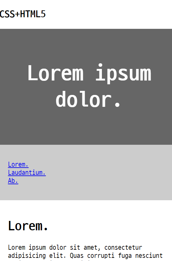
<div class="header">
<h1>My Website</h1>
<p>Lorem ipsum dolor sit amet.</p>
</div>
<div class="topnav">
<a href="#">Link</a> <a href="#">Link</a> <a href="#">Link</a> <a
href="#" style="float: right">Link</a>
</div>
<div class="row">
<div class="firstcolumn">
<div class="card">
<h2>About Me</h2>
<div class="fakeimg">Image</div>
<p>Lorem ipsum dolor sit amet, consectetur adipisicing elit.
Iure quaerat.</p>
</div>
<div class="card">
<h3>Popular Post</h3>
<div class="fakeimg">
<p>Image</p>
</div>
<div class="fakeimg">
<p>Image</p>
</div>
<div class="fakeimg">
<p>Image</p>
</div>
</div>
<div class="card">
<h3>Follow Me</h3>
<p>Some text..</p>
</div>
</div>
<!-- rightcolumn -->
<div class="leftcolumn">
<div class="card">
<h2>TITLE HEADING</h2>
<h5>Title description 2018.8.1</h5>
<div class="fakeimg" style="height: 200px">Image</div>
<p>Some text..</p>
<p>Lorem ipsum dolor sit amet, consectetur adipisicing elit.
Sint ipsum autem natus iusto repellendus nisi accusantium libero
nostrum voluptates molestiae similique eius possimus doloremque
pariatur in.</p>
</div>
</div>
<!-- leftcolumn -->
<div class="rightcolumn">
<div class="card">
<h2>광고</h2>
<div class="fakeimg">Image</div>
<div class="fakeimg">Image</div>
<div class="fakeimg">Image</div>
</div>
<div class="card">
<h3>광고2</h3>
<div class="fakeimg">
<p>Image</p>
</div>
<div class="fakeimg">
<p>Image</p>
</div>
<div class="fakeimg">
<p>Image</p>
</div>
</div>
<div class="card">
<h3>Follow Me</h3>
<p>Some text..</p>
</div>
</div>
<!-- rightcolumn -->
</div>
<!-- row -->
<div class="footer">
<h2>Footer</h2>
</div>
</body>
</html>