CSS - 가상클래스!
가상클래스 (pseudo class)
사실 지금까지 사용했던 :hover 와 같은 : 기호가 붙는 선택자들은 모두 가상 클래스라 한다.
실제 존재하진 않지만 어쩌면 있을수 있는?
특정 조건이 만족하면 생기는?
그런 요소들을 뜻한다.
a태그의 가상 클래스
a:link {
    /* 방문기록없는 a태그 */
}

a:visited {
    /* 방문기록 있는 a태그 */
}

a:hover {
    /* 마우스가 올려진 a태그 */
    background-color: blue;
}

a:active {
    /* 클릭된 a태그 */
}
이런식으로 그냥 a태그가 아닌 특정 조건을 만족하면 생기는 a태그?(가상클래스) 를 선택자로 가리킨다.
위의 결합자와 응용하면 다음같이 적용 가능!
a {
    text-decoration: none;
    text-align: center;
    text-transform: uppercase;
    display: inline-block;
    width: 200px;
    padding: 10px;
    background-color: green;
    color: white;
}

#in {
    width: 200px;
    padding: 10px;
    background: aqua;
    display: none;
}

#out:hover+#in {
    display: block;
}
<div id="out">
    <a href="#" id="out">Mouse Over Me!</a>
    <div id="in">test</div>
</div>
<div id="in">test</div> 는 display: none;으로 설정되어 있기 때문에 평상시에 보이지 않다가 a태그에 hover되어질때 display 된다.
child 가상 클래스
한 태그의 특정 자식 태그를 선택자로 가리킬때 사용, 자식이 있을수도 있고 없을수도 있지만 있다면 스타일을 적용한다.
first-child와 last-child는 첫번째 자식과 마지막 자식을 뜻한다.
div i:first-child {
    background-color: yellow;
}

div i:last-child {
    background-color: red;
}
div자식중 첫번째 i태그, 마지막 i태그를 선택자로 가리킨다.
<div>
    <i>Lorem.</i> <i>Cum!</i> <i>Commodi.</i> <i>Expedita.</i> <i>Eum.</i>
    <i>Amet.</i> <i>Dicta.</i> <i>Delectus.</i> <i>Repudiandae!</i> <i>Excepturi?</i>
</div>

테이블의 첫번째 tr, 마지막 tr태그에 style을 많이주는데 first-child, last-child를 사용하면 효울적이다. (사실 thead, tfoot 쓰는게 정확하다)
테이블에서 짝수번째, 홀수번째, 또는 n번째 자식에게 색을 입히거나 border-bottom을 그리고 싶다면 nth-child를 사용하면 된다.
n번째 자식을 가리킬때 사용하는 태그이다.
table {
table {
    border-collapse:collapse;
    border: solid 1px #ddd;
    text-align: center;
}
tr:nth-child(even) {
    background: #f2f2f2;
}
td, th {
    padding: 15px;
    border-bottom: solid 1px #ddd;
}
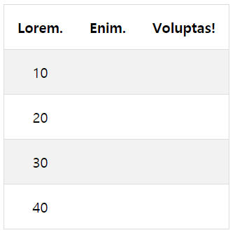
짝수번째 tr만 배경색이 #ddd로 설정됨.
만약 3의 배수 tr을 선택하고 싶다면 tr:nth-child(3n)하면 된다. n을 빼면 해당 요소만을 선택.
nth-last-child()는 역순으로 계산 가능.
https://www.codingfactory.net/10781
first-of-type
자식중에 처음으로 오는 p태그를 찾고 싶다면 first-of-type를 사용하면 된다.
<div>
    <div>Lorem ipsum dolor.</div>
    <p>div 1 Lorem ipsum.</p>
    <p>div 3 Saepe aperiam!</p>
</div>
div가 first-child라서 처음으로 오는 p태그를 못가져온다면 위의 first-of-type을 사용해야한다.
p:first-of-type{
    ...
}
당연히 last-of-child도 있다. 마지막으로 오는 태그를 선택자로 지정 가능하다.
nth-of-type, nth-last-of-type도 있다.
not
선택된 태그중에 해당 태그만 선택에서 제외시키고 싶을때 :not 선택자를 사용한다.
.active {
    background: #4caf50;
}

ul.nav li a:hover:not(.active) {
    background: #111;
}
nav클래스의 li의 a태그가 hover되면 배경색을 바꾸는데 선택자중에서 .active 클래스만큼은 제외시킨다.
원래대로라면 .active클래스 역시 li안의 a태그이기 때문에 배경색이 변경되야 하지만 :not(.active)을 하였기 때문에 변경되지 않는다.
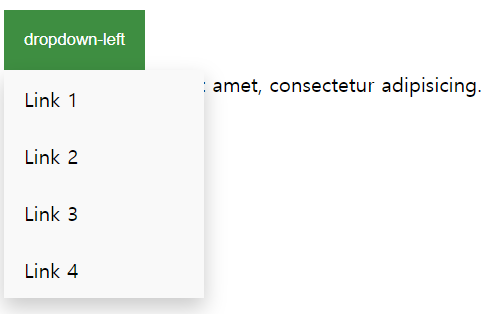
:hover와 display 속성을 잘 사용하면 메뉴버튼을 만들 수 있다.
(마우스를 올리면 메뉴가 출력)
<h3>dropdown menu</h3>
<div class="dropdown" style="float: left">
    <button class="dropbtn">dropdown-left</button>
    <div class="dropdown-content">
        <a href="#">Link 1</a>
        <a href="#">Link 2</a>
        <a href="#">Link 3</a>
        <a href="#">Link 4</a>
    </div>
</div>
<div class="dropdown" style="float: right;">
    <button class="dropbtn">dropdown-right</button>
    <div class="dropdown-content" style="right: 0">
        <a href="#">Link 1</a>
        <a href="#">Link 2</a>
        <a href="#">Link 3</a>
        <a href="#">Link 4</a>
    </div>
</div>
.dropdown {
    position: relative;
    display: inline-block;
}

.dropbtn {
    background-color: #4caf50;
    color: white;
    padding: 16px;
    border: none;
    cursor: pointer;
}

.dropdown-content {
    display: none; /* 버튼 hover하기 전까진 숨김 */
    position: absolute;
    /* absolute는 다른 레이아웃을 건들지 않음 */
    background-color: #f9f9f9;
    min-width: 160px;
    box-shadow: 0px 8px 16px 0px rgb(0, 0, 0, 0.2);
    z-index: 1;
}

.dropdown-content a {
    color: black;
    padding: 12px 16px;
    text-decoration: none;
    display: block;
}

.dropdown-content a:hover {
    background-color: #f1f1f1;
}

.dropbtn:hover {
    background-color: #3e8e41;
}

.dropdown:hover .dropdown-content {
    display: block;
}

.desc {
    text-align: center;
    padding: 10px;
}
가상 요소
가상클래스는 콜론:하나, 가상요소는 콜론::2개이다.
가상 요소는 태그안의 content를 의미함.
p::first-letter {
    color: red;
    font-size: xx-large;
}

p::first-line {
    color: blue;
    font-size: xx-small;
}
first-letter는 p태그 안의 첫 글자 를 뜻함.
first-line는 p태그안의 첫 라인을 뜻함.
first-letter의 우선순위가 높기 때문에 first-line이 오더라도 덮어 씌어지지 않는다.
p::selection {
    color: red;
    background-color: yellow;
}
::selection 드래그해서 잡히는 부분을 뜻함.
p::-moz-selection{ /* firefox */
    color: red;
    background-color: yellow;

}
브라우저별로 지원하는 태그가 다르다.
h1::before {
    content: url("/WebPro/css/images/smiley.gif");
}

h1::after {
    content: "~~~";
    color: red;
}
::before와 ::after는 태그 시작과 끝을 가리킨다.
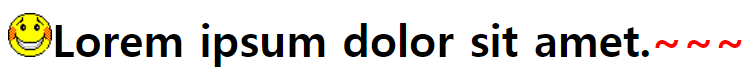
그림처럼 content는 시작과 끝에 표시할 내용을 뜻한다.
hover와 같이 사용하면 마우스를 올리는 순간 해당 태그 앞에 이모티콘이 출력되게 할 수 있다.
::after는 레이아웃에서 중요한 역할을 한다.
row 라는 class이름을 가진 div태그 안의 요소들에게 float: left속성을 줘서 좌측정렬을 시킨후에
row태그가 끝나고도 float: left속성으로 인해 오른쪽에 레이아웃이 붙는 상황이 많은데 ::after를 사용해 이를 방치한다.
.row::after {
    content: "";
    clear: both;
    display: table;
}
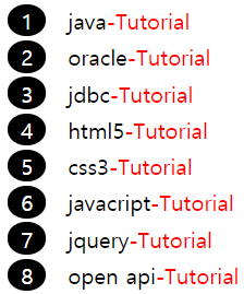
::before - counter
counters는 요소가 몇 번이나 사용되었는지 추적하여 CSS 규칙에 따라 증가하며, 본질적으로 변수.
보통 ::before과 함께 앞에 번호를 붙이는 작업을 많이한다.
body {
    counter-reset: section;
}
section이란 counter변수를 생성, 카운터 이름은 예약되지 않은 문자열만 가능.
counter-reset: section 4; 이런식으로 시작값을 지정할 수 있다.
div {
    margin: 5px;
}
div::before {
    counter-increment: section; /* i++ 같은 작업 */
    content: counter(section);
    background-color: black;
    color: white;
    margin-right: 16px;
    padding: 1px 10px;
    border-radius: 50%;
}
counter-increment: section: section변수의 값을 증가시킨다. 증감시킬 수를 뒤에 숫자로 지정할 수 있다.
content: counter(section); 증가된 기본 십진수 숫자를 ::before의 content로 화면상에 표시한다.
counter(name, style) list-style-type과 동일한 스타일을 적용해서 10진수 외에 다른 표시형식을 사용할 수 있다.
<div>java</div>
<div>oracle</div>
<div>jdbc</div>
<div>html5</div>
<div>css3</div>
<div>javacript</div>
<div>jquery</div>
<div>open api</div>
::before와::after는 표시만 될뿐 드래그나 클릭되지 않는다.
전역변수
:root {
    --main-bg-color: orange;
}
css에서도 모든 스타일 시트에서 사용가능한 전역변수를 정의할 수 있다.
전역변수 선언은 항상 - 2개로 시작한다.
p:first-child {
    background-color: var(--main-bg-color);
}

p:nth-child(2) {
    color: var(--main-bg-color);
}

p:last-child {
    border-style: solid;
    border-width: 1px;
    border-color: var(--main-bg-color);
}
테마 색을 orange에서 skyblue로 바꾼다던가 할 때 위에 정의된 전역변수 하나만 변경하면 되기때문에 유지보수 확장성이 좋아진다.
| Selector | Description |
|---|---|
| :active | :가상클래스(클릭되는순간) |
| :enabled | input태그에서 쓰기가능(enable기본값) |
| :disabled | input태그에서 쓰기불가능(disable속성) |
| :checked | input태그중 checkbox, radio같은 속성에서 사용 |
| :empty | div나 p중 안에 content가 없는 요소를 선택자로 |
| :first-child | 첫번째 자식태그, html도 자식태그로 볼수 있음 |
| :first-of-type | 첫번째로 오는 태그(first-child랑 다름) |
| :last-child | 마지막 자식태그 |
| :last-of-child | 마지막에 있는 해당 태그 |
| :first-letter / :first-line | 첫글자와 첫 라인 |
| :focus | input태그에 focus가있으면 선택자로 |
| :in-range | input type=number 같은 태그에서 범위에 들어가있을 경우 선택자로 |
| :out-of-range | :in-range의 자매품 |
| :invalid | input type=email 같은 태그에서 양식이 잘못되었을 경우 선택자로 |
| :not(select) | 선택한 항목중에서 특정 항목만 제외하고 싶다면 :not(선택자명)을 붙이면 된다. |
| :nth-child() | n번째 자식, n배수 번째 자식을 고르고 싶을 때 |
| only-child / only-of-type | only-child는 자식이 자기자신 하나뿐일때, only-of-type는 자식중 해당타입을 가진자식이 자기자신 하나뿐일때 |
| :required | input태그에서 required속성을 주면 필수 입력칸, 이를 선택자로 지정 |
| :optional | input태그중 required가 지정되지 않는 필수입렵은 아닌 태그를 선택자로 지정 |
| ::placeholder | input태그중 텍스트 입력시 바탕에 표시되는 글을 선택자로 지정 |
| ::before | 가상요소-시작 직후 css가 적용된 content를 붙임. |
| ::after | 가상요소-닫기태그 직전 css가 적용된 content를 붙임. |
| ::placeholder | input태그중 text바에 기본바탕처럼 깔리는 텍스트 -ms-혹은 -webkit-키워드 필요 |
| ::selection | 드래그 해서 선택하는 가상요소 |