Vue - Vuetify!
Vuetify
구글의 Meterial 디자인스펙 기반으로 생성된 디자인 구축용 UI 라이브러리
vue-cli Version 3 이상으로 아래 명령을 수행하면 설치가능하다.
# ensure Vue CLI is >= 3.0
vue --version

vue create my-app
cd my-app
vue add vuetify
import Vue from 'vue'
import vuetify from './plugins/vuetify'

import App from './App.vue'

new Vue({
  vuetify,
  render: h => h(App),
}).$mount('#app')
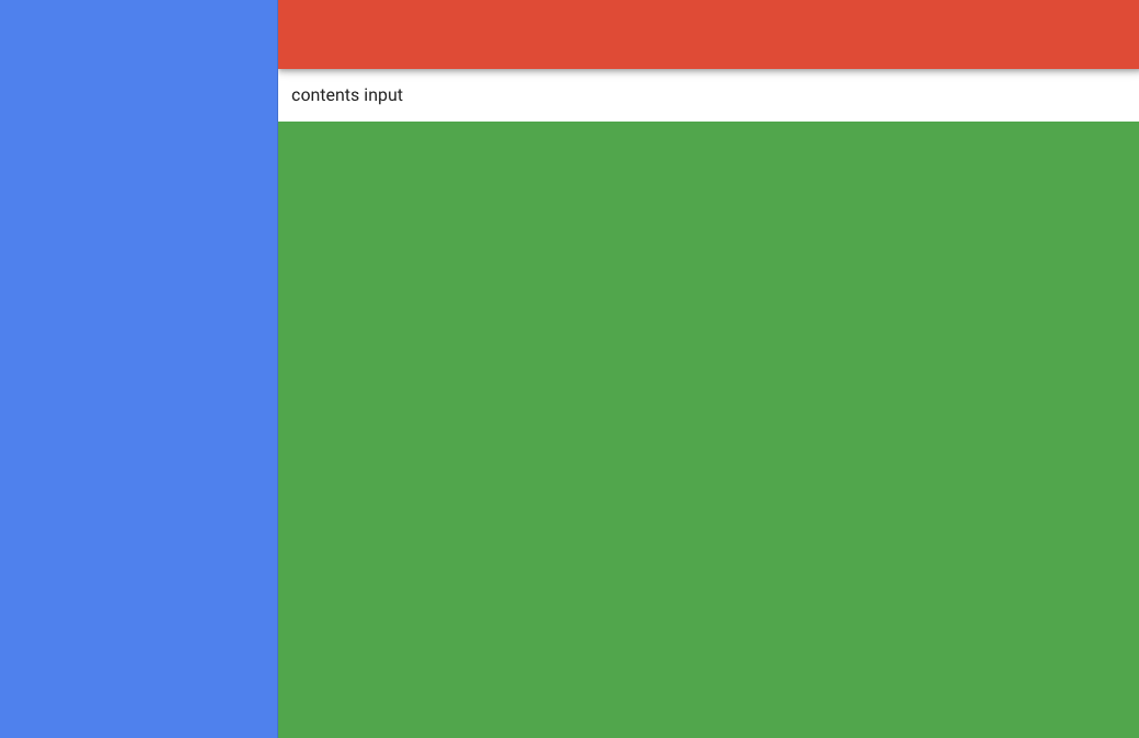
기본 레이아웃
vuetify 기본 레이아웃 요소를 사용하여 쉽게 레이아웃 구축 가능
App.vue 파일에 기본 레이아웃 구성을 진행
<!-- App.vue -->
<template>
  <v-app>
    <v-app-bar app class="red"/>
    <v-navigation-drawer app class="blue"/>
    <v-main class="green">
      <v-container fluid class="white">
        contents input
      </v-container>
    </v-main>
    <v-footer app/>
  </v-app>
</template>
<v-app>                 => <div id=app>
<v-app-bar>             => <haeder>
<v-navigation-drawer>   => <nav>
<v-footer>              => <footer>
vuetify 의 레이아웃 요소는 위와같이 치환된다.
레이아웃 요소의 경우 app 속성이 지정되어야 레이아웃으로 구성된다.
출력된 결과는 아래와 같다.
v-container
<v-container> 는 중앙 중심 컨텐츠 페이지를 구축하기 위해 사용한다.
<v-container fluid>
    <router-view/>
</v-container>
fluid: Removes viewport maximum-width size breakpoints
페이지에 꽉 차도록 설정하고 싶을 때 사용한다.
fluid 설정과 함께 vue 컴포넌트 루트태그를 설정하기 위해 많이 사용한다.
다음과 같은 html 로 변환된다.
<div class="container container--fluid" id="my-container">
    <!-- somthing contents -->
</div>
v-card
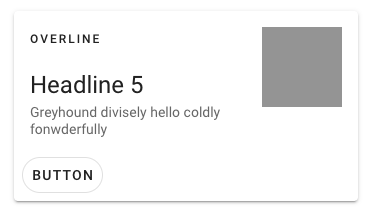
현대적인 카드 UI 구성이 가능하며
적은 문자열 출력, 한 단락을 출력 등 많은 상황에서 레이아웃 구성 용도로 사용한다.
$vuetify.breakpoint
반응형 웹 구성을 위해 화면크기에 따른 접근방식을 달리하고 싶을 때 사용
$vuetify.breakpoint 객체를 통해 현재 브라우저 상태에 대한 정보를 얻을 수 있다.
아래와 같은 속성들이 정의되어 있다.
{
  // Breakpoints
  xs: boolean
  sm: boolean
  md: boolean
  lg: boolean
  xl: boolean

  // Conditionals
  xsOnly: boolean
  smOnly: boolean
  smAndDown: boolean
  smAndUp: boolean
  mdOnly: boolean
  mdAndDown: boolean
  mdAndUp: boolean
  lgOnly: boolean
  lgAndDown: boolean
  lgAndUp: boolean
  xlOnly: boolean

  // true if screen width < mobileBreakpoint
  mobile: boolean
  mobileBreakpoint: number

  // Current breakpoint name (e.g. 'md')
  name: string

  // Dimensions
  height: number
  width: number

  // Thresholds
  // Configurable through options
  {
    xs: number
    sm: number
    md: number
    lg: number
  }

  // Scrollbar
  scrollBarWidth: number
}
Grid System
참고: https://vuetifyjs.com/en/components/grids/
Meteiral concept: https://m2.material.io/design/layout/responsive-layout-grid.html#columns-gutters-and-margins
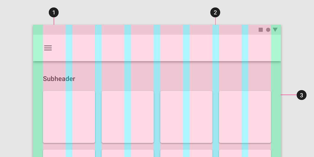
컨텐츠 내용을 표기할 때 그리드를 기초로한 디자인 기법
v-rowv-colv-spacer
위 컴포넌트들을 사용하여 레이아웃 구성이 가능하다.
Typeography
글자 크기를 일괄적으로 처리해주는 기능
class 를 기반으로 글자크기를 사용할 수 있도록 vuetify 가 지원한다.
글자 사이즈 역시 Meterial Design 으로 최적의 크기를 제공한다.
Color
Meterial Design 의 색배열을 지원한다.
https://m2.material.io/design/color/the-color-system.html#color-usage-and-palettes
Helper
각종 css 태그들을 사용하기 쉽게 해주는 속성
d-none: display none
d-sm-block: display block (when size is sm)
환경설정
# .editorconfig
# https://editorconfig.org/
[*.{js,jsx,ts,tsx,vue}]
indent_size = 2
indent_style = space
trim_trailing_whitespace = false
insert_final_newline = true
아래와 같이 exteds, rules 에 속성 추가
module.exports = {
  ...
  'extends': [
    ...
    'plugin:vuetify/base',
  ],
  rules: {
    ...
    'vuetify/no-deprecated-components': 'error',
    'vuetify/no-legacy-grid': 'error'
  }
}
Dialog
중요정보를 출력하거나 입력을 요구할 대 사용하는 UI 컴포넌트