CSS - 네이버 따라하기!
네이버 레이아웃
어떤식으로 레이아웃이 찹혀있는지 정말~ 간단하게 알아보자.
네이버의 메인의 레이아웃은 가장 크게 3부분으로 나뉜다.
이제 세부적으로 큰 레이아웃만 잡아서 구성하면 다음과 같다.
<!DOCTYPE html>
<html lang="ko">
<head>
<style>
* {
box-sizing: border-box;
}
body{
background: white;
}
.wrap{
position: relative;
overflow: hidden;
min-width: 1100px; /* 네이버 메인 width */
background: #f2f4f7;
}
.header{
border-bottom: 1px solid #d1d8e4;
background: yellow;
}
.special_bg{
position: relative;
height: 170px; /* 검색바 height */
background-color: skyblue;
border: solid black 1px;
}
.section_navbar{
position: relative;
height: 46px;
border: solid black 1px;
background-color: #d1d8e4;
}
.container{
margin: 0 auto;
width: 1080px;
}
.column_left{
float: left;
width: 740px;
}
#veta_top{
position: relative;
height: 120px;
border: solid black 1px;
background-color: olive;
}
#news_cast{
overflow: hidden;
}
.area_newstop{
position: relative;
height: 44px;
border: solid black 1px;
background-color: orange;
}
.area_newstand{
position: relative;
height: 244px;
border: solid black 1px;
background-color: darkgreen;
}
.column_right{
position: relative;
float: right;
width: 330px;
}
.section_login{
position: relative;
height: 118px;
border: solid black 1px;
background-color: blanchedalmond;
}
#ad_branding_hide{
position: relative;
height: 310px;
border: 1px solid black;
background-color: mediumpurple;
}
#_PM_timesquare_base{
height: 140px;
border: 1px solid black;
background-color: khaki;
}
#veta_branding{
position: relative;
height: 150px;
border: 1px solid black;
background-color: mediumpurple;
}
.column_bottom{
clear: both;
position: relative;
}
.section_themecast{
position: relative;
float: left;
width: 740px;
height: 882px;
border: 1px solid black;
background-color: lightblue;
}
.section_shoppingcast{
position: relative;
float: right;
width: 330px;
height: 882px;
border: 1px solid black;
background-color: maroon;
}
.column_banner{
clear: both;
position: relative;
}
.section_btmbn{
position: relative;
float: left;
width: 738px;
height: 128px;
border: 1px solid black;
background-color: lightpink;
}
.section_rbn{
position: relative;
float: right;
width: 332px;
height: 130px;
border: 1px solid black;
background-color: aquamarine;
}
.section_footer{
position: relative;
}
.notice{
position: relative;
margin: 0 auto;
width: 1080px;
height: 29px;
border: 1px solid black;
background-color: greenyellow;
}
.aside{
position: relative;
margin: 0 auto;
width: 1080px;
height: 110px;
border: 1px solid black;
background-color: gold;
}
.footer{
position: relative;
}
.area_terms{
position: relative;
margin: 0 auto;
width: 1080px;
height: 132px;
border: 1px solid black;
background-color: tomato;
}
</style>
</head>
<body>
<div class="wrap">
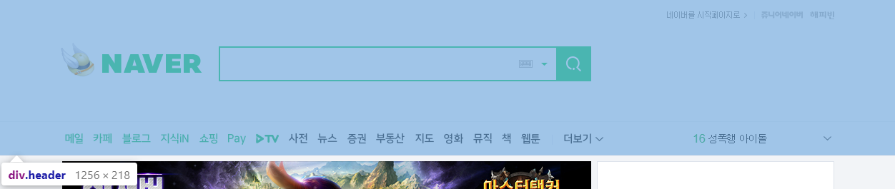
<div class="header">
<div class="special_bg"></div><!-- section_navbar -->
<div class="section_navbar"></div><!-- section_navbar -->
</div> <!-- header -->
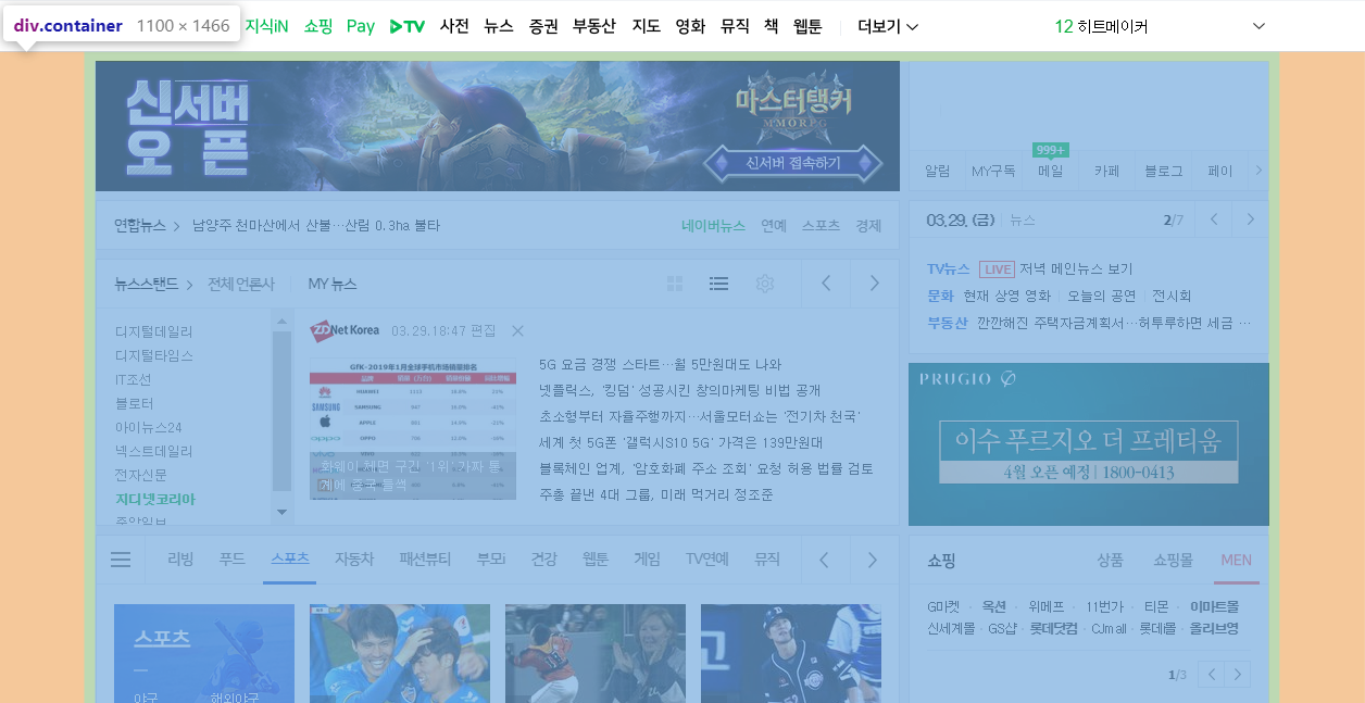
<div class="container">
<div class="column_left">
<div id="veta_top"></div><!-- veta_top -->
<div id="news_cast">
<div class="area_newstop"></div><!-- area_newstop -->
<div class="area_newstand"></div><!-- area_newstand -->
</div><!-- news_cast -->
</div><!-- column_left -->
<div class="column_right">
<div class="section_login"></div><!-- accoun -->
<!-- <div id="ad_branding_hide"></div> --><!-- ad_branding_hide -->
<div id="_PM_timesquare_base"></div><!-- _PM_timesquare_wrapper -->
<div id="veta_branding"></div><!-- veta_branding -->
</div><!-- column_right -->
<div class="column_bottom">
<div class="section_themecast"></div><!-- section_themecast -->
<div class="section_shoppingcast"></div><!-- section_shoppingcast -->
</div><!-- column_bottom -->
<div class="column_banner">
<div class="section_btmbn"></div>
<div class="section_rbn"></div>
</div><!-- column_bottom -->
</div><!-- container -->
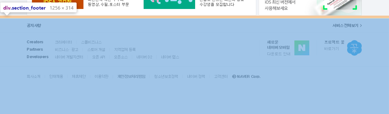
<div class="section_footer">
<div class="notice"></div>
<div class="aside"></div>
<div class="footer">
<div class="area_terms"></div>
</div><!-- footer -->
</div><!-- section_footer -->
</div><!-- wrap -->
</body>
</html>
화려한 레이아웃도 div태그몇개와 css 150줄? 로 구성가능,
물론 세부적으로 안으로 들어가면 훨씬 더 많아진다….
네이버 검색창 레이아웃
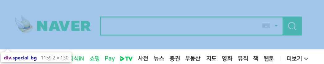
네이버 검색창은 보다싶이 <div class="special_bg">라는 div태그 안에 들어있다.
하나씩 만들어보자…
일단 검색창의 html코드만 보면 다음과 같다.
<div id="search" class="search">
    <span class="green_window">
        <input type="text" id="query" class="input_text" maxlength="255" />
        <a href="#" id="ke_kbd_btn" class="btn_keyboard">
        <span class="ico_keyboard"></span>
        </a>
        <a href="#" class="btn_arw">
            <span class="ico_arr"></span>
        </a>
    </span><!-- green_window -->
    <button id="search_btn" type="button" title="검색"  class="sch_smit">
        <span class="ico_search_submit"></span>
    </button>
</div><!-- search -->
디자인에 외의 속성은 모두 제거하였다.
보면 간단히 div태그안에 span태그안에 input태그, 키보드버튼(img), 내림버튼(img) 하나씩,
그리고 그옆에 검색버튼이 하나 있다.
검색창 역시 모두 css로 구성되어있다.
.search {
    position: absolute;
    top: 50%;
    left: 219px;
    margin-top: -20px;
    width: 512px;
}
가장 상위의 div태그 스타일 시트,
position: absolute; 는 부모위치 기반의 절대위치를 가리키도록 설정하는 기능.
부모인 special_bg div위치에 맞게 설정된다.
자세한 설명: http://ko.learnlayout.com/position.html
검색바의 길이와 위치정도를 정해주는 스타일 시트이다.
* {
    box-sizing: border-box;
}
.search .green_window {
    margin-top: 0;
    width: 470px;
    height: 49px;
    display: inline-block;
    border: 2px solid #03cf5d;
}
span태그에 width 속성을 수기 위해 block: inline-block을 적용
span말고 div로 선언했다면 굳이 display속성을 건들 필요없다.
.search .input_text {
    margin: 12px 0 0 9px; /* 위 왼쪽 아래 오른쪽 */
    width: 405px;
    height: 23px;
    outline: 0;
    border: 0;
    background-color: transparent;
    font-weight: 700; /* bold가 500 */
    font-size: 18px;
}

.search .sch_smit {
    position: absolute;
    top: 0;
    right: 0;
    overflow: visible;
    width: 49px;
    height: 49px;
    border: 0;
    background: #03cf5d;
}
검색창 안의 input태그와 검색 버튼 스타일 시트.
input은 margin을 통해 green window 중앙에,
sch_smit 버튼은 position: absolute를 통해 search태그 오른쪽 상단에 위지.
.ico_search_submit,
.search .btn_keyboard .ico_keyboard,
.search .btn_arw .ico_arr {
    background-image: url(https://s.pstatic.net/static/www/img/2018/sp_search.svg);
    background-repeat: no-repeat;
};
요즘은 버튼 이미지를 img태그를 사용해서 만드는것 보단 a태그, span태그와 svg 파일을 이용해서 디자인 한다.
svg는 벡터 이미지로 확대해도 깨짐이 없고 위와같이 여러 태그의 background로 적용한 후 각 태그에서 표시할 x, y 좌표값과 width, height만 설정하면 원하는 부분만 잘라서 보여줄 수 있다.
client에서 웹페이지 요청시 한번만 svg파일을 불러오면 되기때문에 효율적이다.
a {
    text-decoration: none;
}
.ico_search_submit {
    position: absolute;
    top: 14px;
    left: 14px;
    width: 21px;
    height: 21px;
    background-position: -4px -60px;
}
버튼안의 span class="ico_search_submit" 태그 스타일 시트,
svg의 -4, -60 위치의 이미지를 21px 만큼 가져온다.
.search .btn_keyboard {
    position: absolute;
    top: 50%;
    right: 76px;
    margin-top: -21px;
    padding: 15px 6px;
}

.search .btn_keyboard .ico_keyboard {
    display: block;
    width: 19px;
    height: 11px;
    background-position: -33px -60px;

}
.search .btn_arw {
    position: absolute;
    top: 50%;
    right: 49px;
    margin-top: -21px;
    padding: 19px 12px 19px 6px;
}
.search .btn_arw .ico_arr {
    display: block;
    width: 9px;
    height: 4px;
    background-position: -87px -60px;
}
마찬가지로 a태그 안의 span태그에 넣을 아이콘을 svg에서 backgound-postion으로 가져옴
얼추 비슷한 위치에 레이아웃이 잡힘, 물론 border, margin, padding을 일절 적용하지 않았기 때문에 실제 네이버 레이아웃과는 약간의 오차가 있음.
툴팁(tooltip)
https://www.w3schools.com/css/css_tooltip.asp
툴팁은 다음 사진과 같이 마우스를 올리면 그에대한 설명이 말풍선 처럼 나오는 것을 말함.
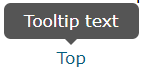
css만으로도 구성이 가능하다. visibility: hidden;으로 숨겨놓고 hover되면 띄우기만 하면 된다.
<body>
    <br><br><br><br><br>
    <div class="tooltip">Mouse on me!
        <span class="tooltiptext">TooltipText</span>
    </div>
    <div>Lorem ipsum dolor.</div>
</body>
</html>
class명 tooltip이라는 div태그에 hover하면 숨겨져 있던 tooltiptext가 보이도록 설정해보자.
div.tooltip {
    position: relative;
    display: inline-block;
    border-bottom: dotted 1px black;
}
툴팁 말풍선 위치 조절을 위해 position: relative로 설정, 그리고 밑줄 하나 긋는다.
이번엔 tootip에 대한 말풍선 역할을 할 tooltiptext의 스타일 시트 설정.
div.tooltip span.tooltiptext {
    visibility: hidden;
    width: 120px;
    background-color: black;
    color: #fff;
    text-align: center;
    border-radius: 6px;
    padding: 5px 0;
    position: absolute;
    z-index: 1;
    transform: translate(-50%, -50%);
    bottom: 100%;
    left: 50%;
}
120px짜리 라운드처리된 검정색 span태그를 부모태그인 div 위(bottom: 100%), 중앙에(left: 50%) 배치한다.
여기서 bottom: 100%은 부모태그인 div의 height길이의 100%만큼(한칸) 위에 tooltiptext의 bottom을 위치하겠다는 뜻.
tooltiptext의 after에 화살표처리를 해야하는데 특수기호를 사용할 수 도 있지만 border를 사용할 수 있다.
.test {
    box-sizing: border-box;
    border: 20px solid;
    border-top-color: red;
    border-left-color: orange;
    border-bottom-color: green;
    border-right-color: blue;
    width: 40px;
    height: 40px;
}
border두께와 width, height를 일치시키면 다음과 같은 모양으로 나타난다.

여기서 border-top을 제외한 모든 border를 투명처리하면 아래를 가리키는 화살표가 만들어진다.
div {
border-top-color: black;
border-left-color: transparent;
border-bottom-color: transparent;
border-right-color: transparent;
}
만들어진 화살표는 tooltiptext 태그 아래 적절한 위치에 ::after 가상요소를 통해 붙여넣으면 된다.
div.tooltip span.tooltiptext::after {
    content: "";
    position: absolute;
    top: 100%;
    left: 50%;
    margin-left: -5px;
    border-width: 5px;
    border-style: solid;
    border-color: black transparent transparent transparent;
}

div.tooltip:hover span.tooltiptext {
    visibility: visible;
}
툴팁은 설명글말고 사진도 띄울 수 있다.
<div class="tooltip">Mouse on me!
    <span class="tooltiptext">
        <img src="C:\Class\WebClass\WebPro\WebContent\css\images\img_avatar.png" style="width: 100%;height:auto" alt="" />
    </span>
</div>
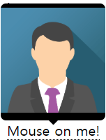
지도에서 클릭하면 튀어나오는 표식같은 것 도 위와같은 방법으로 생성 가능.