CSS - 애니메이션 transition!
transition
transition: 다른 상태로의 전환
html 요소가 상태a 에서 상태b 로 가는 시간조절 가능,
시간 흐름에 따라 변경되기 때문에 애니메이션틱 하다.
<head>
  <link rel="stylesheet" href="https://cdnjs.cloudflare.com/ajax/libs/font-awesome/4.7.0/css/font-awesome.min.css">
  <style>
    .mySideNav {
      display: flex;
      flex-direction: column;
      justify-content: space-between;
    }
    /* 상태a */
    .mySideNav a {
      position: relative;
      padding: 15px;
      margin: 2px;
      width: 150px;
      font-size: 20px;
      color: white;
      border-radius: 0 5px 5px 0;
      /* 왼쪽에 파묻기, 0.3초간 진행 */
      left: -120px;
      transition: 0.3s;
    }
    /* 상태b */
    .mySideNav a:hover { left: -10px; }

    .mySideNav i { float: right; }
    .facebook { background-color: blue; }
    .twitter  { background-color: aqua; }
    .google   { background-color: black; }
    .youtube  { background-color: red; }
  </style>
</head>

<body>
  <div class="mySideNav">
    <a class="facebook">facebook<i class="fa fa-facebook"></i></a>
    <a class="twitter">twitter<i class="fa fa-twitter"></i></a>
    <a class="google">html<i class="fa fa-google"></i></a>
    <a class="youtube">youtube<i class="fa fa-youtube"></i></a>
  </div>
</body>
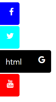
이런식으로 hover되는 순간 옆에서 튀어나온다.
transition의 여러 속성들
transition-property: width; /* 변화 탐지 */
transition-duration: 2s; /* 변화에 걸리는 시간 */
transition-timing-function: linear; /* 변화율 조정속성 */
transition-delay: 1s; /* 변화 시작시간 */
다음과 같이 한번에 쓸 수 있다.
transition: width 2s linear 1s;
width와 height에 대한 변환 시간, 나머지에 대한 변환시간을 따로따로 지정할 수 있다.
transition:width 0.3s, height 1s, 0.5s;
width가 변하는 시간은0.3s,height가 변하는 시간은1s진행, 그리고 나머지 변화시간(회전, 위치이동)은0.5s간 진행.
transition-property 가 생략되면 width, height 를 포함한 모든 변화에 대해 적용,
transition-timing-function에 대해선 아래에서 설명.
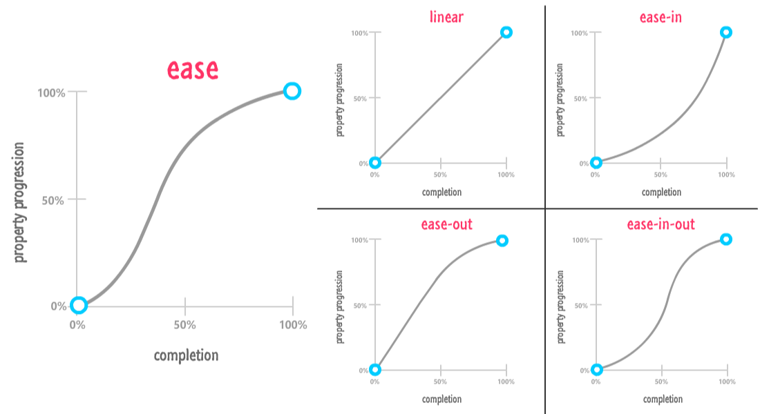
timing-function
다음과 같은 값을 가질 수 있다.
ease : 조금 부드럽고 빠르게 속성값에 진입하여 천천히 부드럽게 멈춘다(기본값)
linear : 물리시간에 등.속.운.동이라고 배운 일.직.선 운동이다.
ease-in : 천천히 부드럽게 시작하여 점점 빠르게 속성값에 다다른다.
ease-out : ease-in 과 반대로 빠르게 시작하여 점점 천천히 도달한다.
ease-in-out : ease-in 으로 시작하여 ease-out 으로 끝나는 운동, 천천히 부드럽게 시작하여 점점 빠르게 도달할 즈음 속도를 줄여 부드럽게 멈춘다.
@keyframes
A상태에서 B 상태로 가도록 from, to 설정을 할 수 있다.
@keyframes example{
/* A상태에서 B 상태로 */
    from { /* A */
        background-color: green;
    }
    to { /* B */
        background-color: red;
    }
}
물론 브라우저마다 지원 키워드가 다름으로 @-webkit-keyframes 처럼 접두어를 붙여야한다.
0에서 1에 진행하는 from..to 말고 %단위로 쪼갤수 있다.
@-webkit-keyframes example3{
    0% {
        background-color: green;
        transform: rotate(360deg);
        left: 0px;
        top: 0px;
    }
    25% {
        background-color: blue;
        transform: rotate(-360deg);
        left: 200px;
        top: 0px;
    }
    50% {
        background-color: yellow;
        transform: rotate(360deg);
        left: 200px;
        top: 200px;

    }
    75% {
        background-color: aqua;
        transform: rotate(-360deg);
        left: 0px;
        top: 200px;
    }
    100% {
        background-color: red;
        transform: rotate(360deg);
        left: 0px;
        top: 0px;
    }
}
0% ~ 100% 로 진행하는동안 색이 4번, 360도 회전도 4번 이동도 4번된다.
(0%상태는 기존값)
animation
변화될 상태,
keyframes를 정의했으면 div나 p와 같은 요소 스타일 시트에서 사용하도록 설정해야 하는데 animation속성을 사용하면 된다.
div {
animation-name: example3;
animation-duration: 4s;
animation-iteration-count: 3;
animation-iteration-count: infinite;
animation-direction: reverse; /* alternative (진자운동) */
animation-timing-function: ease;
} /* transition 의 timing-function 과 동일 */
단축설정 가능
animation: test1 5s infinite;
example3 이름의 keyframes을 사용하고 duration과 timing-function은 tarsistion속성과 효과가 같다.
animation-iteration-count은 keyframes를 몇번 반복할 건지 횟수지정이 가능하고 계속 동작시킨다면 infinite로 설정.
animation도 브라우저별 지원을 위해 접두어를 붙여햐 한다.
-ms-animation-name