네이버 레이아웃
어떤식으로 레이아웃이 찹혀있는지 정말~ 간단하게 알아보자.
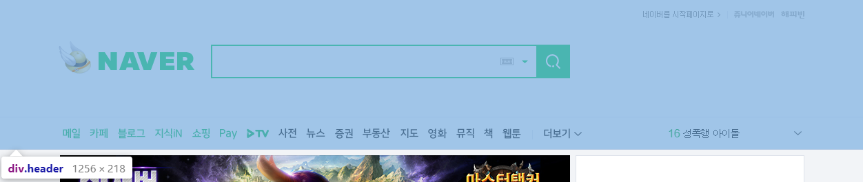
네이버의 메인의 레이아웃은 가장 크게 3부분으로 나뉜다.
 {: .shadow}
 {: .shadow}
 {: .shadow}
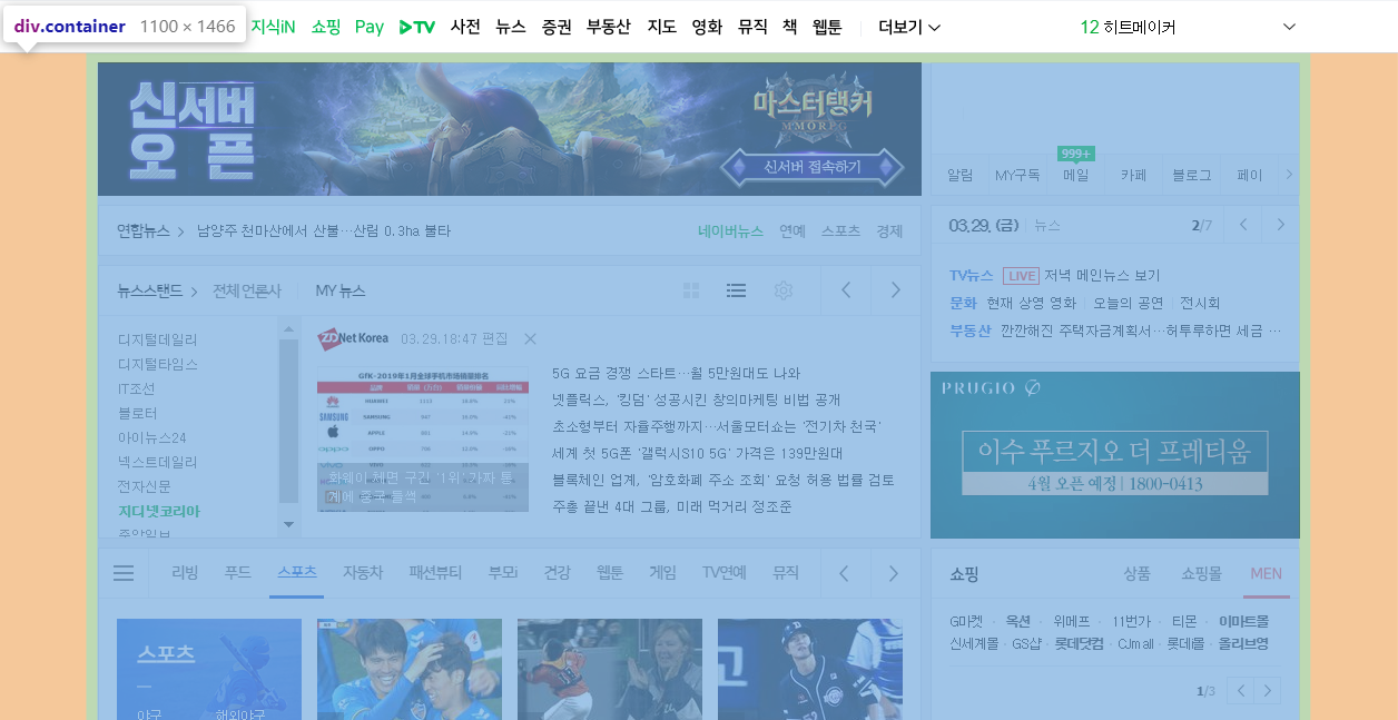
이제 세부적으로 큰 레이아웃만 잡아서 구성하면 다음과 같다.
1
2
3
4
5
6
7
8
9
10
11
12
13
14
15
16
17
18
19
20
21
22
23
24
25
26
27
28
29
30
31
32
33
34
35
36
37
38
39
40
41
42
43
44
45
46
47
48
49
50
51
52
53
54
55
56
57
58
59
60
61
62
63
64
65
66
67
68
69
70
71
72
73
74
75
76
77
78
79
80
81
82
83
84
85
86
87
88
89
90
91
92
93
94
95
96
97
98
99
100
101
102
103
104
105
106
107
108
109
110
111
112
113
114
115
116
117
118
119
120
121
122
123
124
125
126
127
128
129
130
131
132
133
134
135
136
137
138
139
140
141
142
143
144
145
146
147
148
149
150
151
152
153
154
155
156
157
158
159
160
161
162
163
164
165
166
167
168
169
170
171
172
173
174
175
176
177
178
179
180
181
182
183
184
185
186
187
188
189
190
191
192
193
194
195
196
197
198
199
200
201
202
203
204
205
206
207
208
209
210
211
| <!DOCTYPE html>
<html lang="ko">
<head>
<style>
* {
box-sizing: border-box;
}
body{
background: white;
}
.wrap{
position: relative;
overflow: hidden;
min-width: 1100px;
background: #f2f4f7;
}
.header{
border-bottom: 1px solid #d1d8e4;
background: yellow;
}
.special_bg{
position: relative;
height: 170px;
background-color: skyblue;
border: solid black 1px;
}
.section_navbar{
position: relative;
height: 46px;
border: solid black 1px;
background-color: #d1d8e4;
}
.container{
margin: 0 auto;
width: 1080px;
}
.column_left{
float: left;
width: 740px;
}
#veta_top{
position: relative;
height: 120px;
border: solid black 1px;
background-color: olive;
}
#news_cast{
overflow: hidden;
}
.area_newstop{
position: relative;
height: 44px;
border: solid black 1px;
background-color: orange;
}
.area_newstand{
position: relative;
height: 244px;
border: solid black 1px;
background-color: darkgreen;
}
.column_right{
position: relative;
float: right;
width: 330px;
}
.section_login{
position: relative;
height: 118px;
border: solid black 1px;
background-color: blanchedalmond;
}
#ad_branding_hide{
position: relative;
height: 310px;
border: 1px solid black;
background-color: mediumpurple;
}
#_PM_timesquare_base{
height: 140px;
border: 1px solid black;
background-color: khaki;
}
#veta_branding{
position: relative;
height: 150px;
border: 1px solid black;
background-color: mediumpurple;
}
.column_bottom{
clear: both;
position: relative;
}
.section_themecast{
position: relative;
float: left;
width: 740px;
height: 882px;
border: 1px solid black;
background-color: lightblue;
}
.section_shoppingcast{
position: relative;
float: right;
width: 330px;
height: 882px;
border: 1px solid black;
background-color: maroon;
}
.column_banner{
clear: both;
position: relative;
}
.section_btmbn{
position: relative;
float: left;
width: 738px;
height: 128px;
border: 1px solid black;
background-color: lightpink;
}
.section_rbn{
position: relative;
float: right;
width: 332px;
height: 130px;
border: 1px solid black;
background-color: aquamarine;
}
.section_footer{
position: relative;
}
.notice{
position: relative;
margin: 0 auto;
width: 1080px;
height: 29px;
border: 1px solid black;
background-color: greenyellow;
}
.aside{
position: relative;
margin: 0 auto;
width: 1080px;
height: 110px;
border: 1px solid black;
background-color: gold;
}
.footer{
position: relative;
}
.area_terms{
position: relative;
margin: 0 auto;
width: 1080px;
height: 132px;
border: 1px solid black;
background-color: tomato;
}
</style>
</head>
<body>
<div class="wrap">
<div class="header">
<div class="special_bg"></div>
<div class="section_navbar"></div>
</div>
<div class="container">
<div class="column_left">
<div id="veta_top"></div>
<div id="news_cast">
<div class="area_newstop"></div>
<div class="area_newstand"></div>
</div>
</div>
<div class="column_right">
<div class="section_login"></div>
<div id="_PM_timesquare_base"></div>
<div id="veta_branding"></div>
</div>
<div class="column_bottom">
<div class="section_themecast"></div>
<div class="section_shoppingcast"></div>
</div>
<div class="column_banner">
<div class="section_btmbn"></div>
<div class="section_rbn"></div>
</div>
</div>
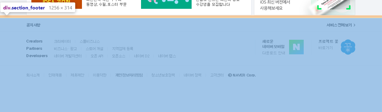
<div class="section_footer">
<div class="notice"></div>
<div class="aside"></div>
<div class="footer">
<div class="area_terms"></div>
</div>
</div>
</div>
</body>
</html>
|
화려한 레이아웃도 div태그몇개와 css 150줄? 로 구성가능,
물론 세부적으로 안으로 들어가면 훨씬 더 많아진다….
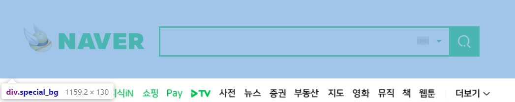
네이버 검색창 레이아웃
 {: .shadow}
네이버 검색창은 보다싶이 <div class="special_bg">라는 div태그 안에 들어있다.
하나씩 만들어보자…
일단 검색창의 html코드만 보면 다음과 같다.
1
2
3
4
5
6
7
8
9
10
11
12
13
14
| <div id="search" class="search">
<span class="green_window">
<input type="text" id="query" class="input_text" maxlength="255" />
<a href="#" id="ke_kbd_btn" class="btn_keyboard">
<span class="ico_keyboard"></span>
</a>
<a href="#" class="btn_arw">
<span class="ico_arr"></span>
</a>
</span>
<button id="search_btn" type="button" title="검색" class="sch_smit">
<span class="ico_search_submit"></span>
</button>
</div>
|
디자인에 외의 속성은 모두 제거하였다.
보면 간단히 div태그안에 span태그안에 input태그, 키보드버튼(img), 내림버튼(img) 하나씩,
그리고 그옆에 검색버튼이 하나 있다.
검색창 역시 모두 css로 구성되어있다.
1
2
3
4
5
6
7
| .search {
position: absolute;
top: 50%;
left: 219px;
margin-top: -20px;
width: 512px;
}
|
가장 상위의 div태그 스타일 시트,
position: absolute; 는 부모위치 기반의 절대위치를 가리키도록 설정하는 기능.
부모인 special_bg div위치에 맞게 설정된다.
자세한 설명: http://ko.learnlayout.com/position.html
검색바의 길이와 위치정도를 정해주는 스타일 시트이다.
1
2
3
4
5
6
7
8
9
10
| * {
box-sizing: border-box;
}
.search .green_window {
margin-top: 0;
width: 470px;
height: 49px;
display: inline-block;
border: 2px solid #03cf5d;
}
|
span태그에 width 속성을 수기 위해 block: inline-block을 적용
span말고 div로 선언했다면 굳이 display속성을 건들 필요없다.
1
2
3
4
5
6
7
8
9
10
11
12
13
14
15
16
17
18
19
20
21
| .search .input_text {
margin: 12px 0 0 9px;
width: 405px;
height: 23px;
outline: 0;
border: 0;
background-color: transparent;
font-weight: 700;
font-size: 18px;
}
.search .sch_smit {
position: absolute;
top: 0;
right: 0;
overflow: visible;
width: 49px;
height: 49px;
border: 0;
background: #03cf5d;
}
|
검색창 안의 input태그와 검색 버튼 스타일 시트.
input은 margin을 통해 green window 중앙에,
sch_smit 버튼은 position: absolute를 통해 search태그 오른쪽 상단에 위지.
1
2
3
4
5
6
| .ico_search_submit,
.search .btn_keyboard .ico_keyboard,
.search .btn_arw .ico_arr {
background-image: url(https://s.pstatic.net/static/www/img/2018/sp_search.svg);
background-repeat: no-repeat;
};
|
요즘은 버튼 이미지를 img태그를 사용해서 만드는것 보단 a태그, span태그와 svg 파일을 이용해서 디자인 한다.
svg는 벡터 이미지로 확대해도 깨짐이 없고 위와같이 여러 태그의 background로 적용한 후 각 태그에서 표시할 x, y 좌표값과 width, height만 설정하면 원하는 부분만 잘라서 보여줄 수 있다.
client에서 웹페이지 요청시 한번만 svg파일을 불러오면 되기때문에 효율적이다.
1
2
3
4
5
6
7
8
9
10
11
| a {
text-decoration: none;
}
.ico_search_submit {
position: absolute;
top: 14px;
left: 14px;
width: 21px;
height: 21px;
background-position: -4px -60px;
}
|
버튼안의 span class="ico_search_submit" 태그 스타일 시트,
svg의 -4, -60 위치의 이미지를 21px 만큼 가져온다.
1
2
3
4
5
6
7
8
9
10
11
12
13
14
15
16
17
18
19
20
21
22
23
24
25
26
27
28
29
| .search .btn_keyboard {
position: absolute;
top: 50%;
right: 76px;
margin-top: -21px;
padding: 15px 6px;
}
.search .btn_keyboard .ico_keyboard {
display: block;
width: 19px;
height: 11px;
background-position: -33px -60px;
}
.search .btn_arw {
position: absolute;
top: 50%;
right: 49px;
margin-top: -21px;
padding: 19px 12px 19px 6px;
}
.search .btn_arw .ico_arr {
display: block;
width: 9px;
height: 4px;
background-position: -87px -60px;
}
|
마찬가지로 a태그 안의 span태그에 넣을 아이콘을 svg에서 backgound-postion으로 가져옴
{: .shadow}
얼추 비슷한 위치에 레이아웃이 잡힘, 물론 border, margin, padding을 일절 적용하지 않았기 때문에 실제 네이버 레이아웃과는 약간의 오차가 있음.
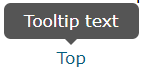
https://www.w3schools.com/css/css_tooltip.asp
툴팁은 다음 사진과 같이 마우스를 올리면 그에대한 설명이 말풍선 처럼 나오는 것을 말함.
 {: .shadow}
css만으로도 구성이 가능하다. visibility: hidden;으로 숨겨놓고 hover되면 띄우기만 하면 된다.
1
2
3
4
5
6
7
8
| <body>
<br><br><br><br><br>
<div class="tooltip">Mouse on me!
<span class="tooltiptext">TooltipText</span>
</div>
<div>Lorem ipsum dolor.</div>
</body>
</html>
|
class명 tooltip이라는 div태그에 hover하면 숨겨져 있던 tooltiptext가 보이도록 설정해보자.
1
2
3
4
5
| div.tooltip {
position: relative;
display: inline-block;
border-bottom: dotted 1px black;
}
|
툴팁 말풍선 위치 조절을 위해 position: relative로 설정, 그리고 밑줄 하나 긋는다.
이번엔 tootip에 대한 말풍선 역할을 할 tooltiptext의 스타일 시트 설정.
1
2
3
4
5
6
7
8
9
10
11
12
13
14
| div.tooltip span.tooltiptext {
visibility: hidden;
width: 120px;
background-color: black;
color: #fff;
text-align: center;
border-radius: 6px;
padding: 5px 0;
position: absolute;
z-index: 1;
transform: translate(-50%, -50%);
bottom: 100%;
left: 50%;
}
|
120px짜리 라운드처리된 검정색 span태그를 부모태그인 div 위(bottom: 100%), 중앙에(left: 50%) 배치한다.
여기서 bottom: 100%은 부모태그인 div의 height길이의 100%만큼(한칸) 위에 tooltiptext의 bottom을 위치하겠다는 뜻.
tooltiptext의 after에 화살표처리를 해야하는데 특수기호를 사용할 수 도 있지만 border를 사용할 수 있다.
1
2
3
4
5
6
7
8
9
10
| .test {
box-sizing: border-box;
border: 20px solid;
border-top-color: red;
border-left-color: orange;
border-bottom-color: green;
border-right-color: blue;
width: 40px;
height: 40px;
}
|
border두께와 width, height를 일치시키면 다음과 같은 모양으로 나타난다.
 {: .shadow}
여기서 border-top을 제외한 모든 border를 투명처리하면 아래를 가리키는 화살표가 만들어진다.
1
2
3
4
5
6
| div {
border-top-color: black;
border-left-color: transparent;
border-bottom-color: transparent;
border-right-color: transparent;
}
|
만들어진 화살표는 tooltiptext 태그 아래 적절한 위치에 ::after 가상요소를 통해 붙여넣으면 된다.
1
2
3
4
5
6
7
8
9
10
11
12
13
14
| div.tooltip span.tooltiptext::after {
content: "";
position: absolute;
top: 100%;
left: 50%;
margin-left: -5px;
border-width: 5px;
border-style: solid;
border-color: black transparent transparent transparent;
}
div.tooltip:hover span.tooltiptext {
visibility: visible;
}
|
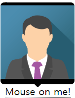
툴팁은 설명글말고 사진도 띄울 수 있다.
1
2
3
4
5
| <div class="tooltip">Mouse on me!
<span class="tooltiptext">
<img src="C:\Class\WebClass\WebPro\WebContent\css\images\img_avatar.png" style="width: 100%;height:auto" alt="" />
</span>
</div>
|
 {: .shadow}
지도에서 클릭하면 튀어나오는 표식같은 것 도 위와같은 방법으로 생성 가능.