반응형 웹 동적으로 해당 장치에서 브라우저 전체 웹 페이지의 화면이 맞게 자동 축소, 확대되어야 한다.
뷰포트(ViewPort) : 웹페이지 사용자가 볼 수 있는 영역
뷰포트는 <meta> 태그를 사용해서 설정 가능하다.
1 <meta name ="viewport" content ="width=device-width, initial-scale=1.0" >
width=device-width: 페이지의 너비를 장치에 따라 설정initial-sacle=1.0: 처름로딩될때 장치 크기에 맞게 1:1 크기로 설정된다,
작은화면, 큰화면 상관없이 1:1 크기로 웹페이지가 맞춰짐.
뷰포트에 컨테츠 크기를 맞추기 뷰포트 구성은 아래 3가지 규칙을 가짐
큰 고정폭 요소를 사용하지 않는다. (장치마다 넓이가 다르기 때문, 고정값을 사용하지 않는다(비율 사용))
특정 뷰포트 너비를 사용하여 내용을 랜더링하지 않는다. (픽셀 단위로 지정하면 디바이스 해상도에 따라 다르게 보임)
CSS @media를 사용하여 크고 작은 화면에 다른 스타일을 적용한다.
@media: 미디어쿼리, CSS2 부터 사용가능
서로 다른 미디어 장치 유형에 따라 style을 다르게 적용할 수 있다.CSS3 이 되며 기능이 대폭 추가되었다.
@media 사용해서 뷰포트의 높이와 너비를 확인 가능하다,@media 를 통해 장치 가로, 세로 크기, 혹은 방향을 알아오고 이를 통해 디자인 한다.
레이아웃에서 nav, article div 요소의 가로길이가 600px이하로 될경우 width: 100% 으로 설정,
1
2
3
4
5
6
7
8
9
10
<head> <meta name="viewport" content ="width =device-width , initial-scale =1.0 "> </head> ... @media only screen and (max-width :600px ){ div #nav , div #article { width : 100% ; height : auto; } }
이런식으로 30, 70% 였던 div가 크기에 반응하여 서로 100%가 되며 바뀜
w 단위 font size <p style="font-size: 1w;">Lorem ipsum dolor sit amet.</p>
viewport와 width의 약자, 브라우저(뷰포트) 크기에 따라 글자 크기도 바뀐다.
1
2
3
4
5
6
7
8
9
10
11
12
13
14
15
16
17
18
19
20
21
22
23
24
25
26
27
28
29
30
31
32
33
34
35
36
37
38
39
40
41
42
43
44
45
46
47
48
49
50
51
52
53
54
55
56
57
58
59
60
61
62
63
64
65
66
67
68
69
70
71
72
73
74
75
76
77
78
79
80
81
82
83
84
85
86
87
88
89
90
91
92
93
94
95
96
97
98
99
100
101
102
103
104
105
106
107
108
109
110
111
112
113
114
115
116
117
118
119
120
121
122
123
124
125
126
127
128
129
130
131
132
<!DOCTYPE html > <html > <head > <meta charset ="UTF-8" > <title > Insert title here</title > <link rel ="stylesheet" type ="text/css" href ="" /> <meta name ="viewport" content ="width=device-width, initial-scale=1.0" > <style > * { box-sizing : border-box; } input [type="text" ] , select , textarea { width : 100% ; padding : 12px ; border : solid 1px #ccc ; border-radius : 4px ; resize : vertical; } label { display : inline-block; padding : 12px 12px 12px 0 ; } .container { border-radius : 5px ; background-color : #f2f2f2 ; padding : 20px ; } .row { border : 1px solid black; overflow : auto; } .row ::after { content : "" ; clear : both; } .col-25 { float : left; width : 25% ; margin-top : 6px ; } .col-75 { float : left; width : 75% ; margin-top : 6px ; } input [type="submit" ] { background-color : #3caf50 ; color : white; padding : 12px 20px ; border : none; border-radius : 4px ; cursor : pointer; float : right; } input [type="submit" ] :hover { background-color : #45a049 ; } </style > <style > @media screen and (max-width :600px ) { .col-75 , .col-25 , input [type="submit" ] { width : 100% ; margin-top : 0 ; } } </style > </head > <body > <form action ="" > <div class ="container" > <div class ="row" > <div class ="col-25" > <label for ="fname" > First Name</label > </div > <div class ="col-75" > <input type ="text" id ="fname" name ="firstname" placeholder ="Your name.." /> </div > </div > <div class ="row" > <div class ="col-25" > <label for ="lname" > Last Name</label > </div > <div class ="col-75" > <input type ="text" id ="lname" name ="lastname" placeholder ="Your last name.." /> </div > </div > <div class ="row" > <div class ="col-25" > <label for ="country" > Country</label > </div > <div class ="col-75" > <select name ="country" id ="country" > <option value ="a" > A</option > <option value ="b" > B</option > <option value ="korea" selected ="selected" > korea</option > </select > </div > </div > <div class ="row" > <div class ="col-25" > <label for ="subject" > Subject</label > </div > <div class ="col-75" > <textarea name ="subject" id ="subject" placeholder ="subject write.." style ="height: 200px" > </textarea > </div > </div > <div class ="row" > <input type ="submit" value ="Submit" /> </div > </div > </form > </body > </html >
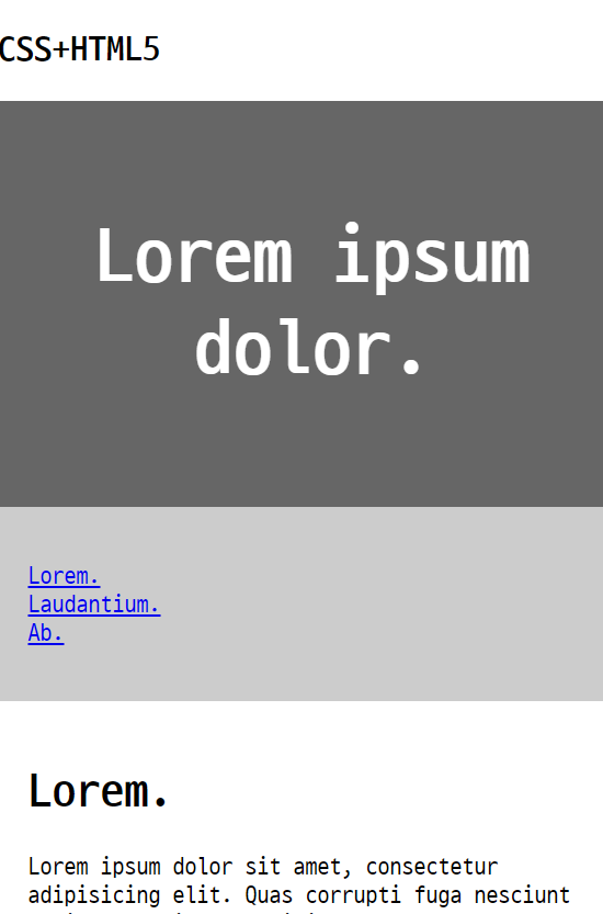
1
2
3
4
5
6
7
8
9
10
11
12
13
14
15
16
17
18
19
20
21
22
23
24
25
26
27
28
29
30
31
32
33
34
35
36
37
38
39
40
41
42
43
44
45
46
47
48
49
50
51
52
53
54
55
56
57
58
59
60
61
62
63
64
65
66
67
68
69
70
71
72
73
74
75
76
77
78
79
80
81
82
83
84
85
86
87
88
89
90
91
92
93
94
95
96
97
98
99
100
101
102
103
104
105
106
107
108
109
110
111
112
113
114
115
116
117
118
119
120
121
122
123
124
125
126
127
128
129
130
131
132
133
134
135
136
137
138
139
140
141
142
143
144
145
146
147
148
149
150
151
152
153
154
155
156
157
158
159
160
161
162
163
164
165
166
167
168
169
170
171
172
173
174
175
176
177
178
179
180
181
182
183
184
185
186
187
188
189
190
191
192
193
194
195
196
197
198
199
200
201
202
203
204
205
206
207
<!DOCTYPE html > <html > <head > <meta charset ="UTF-8" > <meta name ="viewport" content ="width=device-width, initial-scale=1.0" > <title > Insert title here</title > <link rel ="stylesheet" type ="text/css" href ="" /> <style > * { box-sizing : border-box; } body { font-family : Arial; padding : 10px ; background-color : #f2f2f2 ; } .header { padding : 30px ; text-align : center; background-color : white; } .header h1 { font-size : 50px ; } .topnav { overflow : hidden; background-color : #333 ; } .topnav a { display : block; float : left; color : #f2f2f2 ; text-align : center; padding : 14px 16px ; text-decoration : none; } .topnav a :hover { background-color : white; color : black; } .firstcolumn { border : 1px solid black; float : left; width : 25% ; float : left; } .leftcolumn { border : 1px solid black; float : left; width : 50% ; float : left; } .rightcolumn { border : 1px solid black; float : left; width : 25% ; } .card .fakeimg { background-color : #aaa ; width : 100% ; padding : 20px ; } .card { background-color : white; width : 100% ; padding : 20px ; } .row ::after { content : "" ; clear : both; display : table; } .footer { padding : 20px ; text-align : center; background-color : #ddd ; margin-top : 20px ; } </style > <style > @media screen and (max-width : 800px ) { .firstcolumn , .leftcolumn , .rightcolumn { width : 100% ; padding : 0 ; } } @media screen and (max-width : 400px ) { .topnav a { float : none !important ; width : 100% ; } } </style > </head > <body > <div class ="header" > <h1 > My Website</h1 > <p > Lorem ipsum dolor sit amet.</p > </div > <div class ="topnav" > <a href ="#" > Link</a > <a href ="#" > Link</a > <a href ="#" > Link</a > <a href ="#" style ="float: right" > Link</a > </div > <div class ="row" > <div class ="firstcolumn" > <div class ="card" > <h2 > About Me</h2 > <div class ="fakeimg" > Image</div > <p > Lorem ipsum dolor sit amet, consectetur adipisicing elit. Iure quaerat.</p > </div > <div class ="card" > <h3 > Popular Post</h3 > <div class ="fakeimg" > <p > Image</p > </div > <div class ="fakeimg" > <p > Image</p > </div > <div class ="fakeimg" > <p > Image</p > </div > </div > <div class ="card" > <h3 > Follow Me</h3 > <p > Some text..</p > </div > </div > <div class ="leftcolumn" > <div class ="card" > <h2 > TITLE HEADING</h2 > <h5 > Title description 2018.8.1</h5 > <div class ="fakeimg" style ="height: 200px" > Image</div > <p > Some text..</p > <p > Lorem ipsum dolor sit amet, consectetur adipisicing elit. Sint ipsum autem natus iusto repellendus nisi accusantium libero nostrum voluptates molestiae similique eius possimus doloremque pariatur in.</p > </div > <div class ="card" > <h2 > TITLE HEADING</h2 > <h5 > Title description 2018.8.1</h5 > <div class ="fakeimg" style ="height: 200px" > Image</div > <p > Some text..</p > <p > Lorem ipsum dolor sit amet, consectetur adipisicing elit. Sint ipsum autem natus iusto repellendus nisi accusantium libero nostrum voluptates molestiae similique eius possimus doloremque pariatur in.</p > </div > </div > <div class ="rightcolumn" > <div class ="card" > <h2 > 광고</h2 > <div class ="fakeimg" > Image</div > <div class ="fakeimg" > Image</div > <div class ="fakeimg" > Image</div > </div > <div class ="card" > <h3 > 광고2</h3 > <div class ="fakeimg" > <p > Image</p > </div > <div class ="fakeimg" > <p > Image</p > </div > <div class ="fakeimg" > <p > Image</p > </div > </div > <div class ="card" > <h3 > Follow Me</h3 > <p > Some text..</p > </div > </div > </div > <div class ="footer" > <h2 > Footer</h2 > </div > </body > </html >
 {: .shadow}